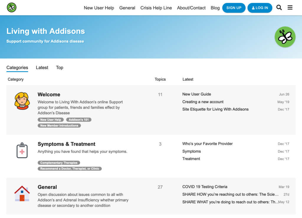
We’re so excited to announce that our community sites will soon have a fresh new look. Compared with the old one, members will notice a much cleaner site. The colors will be fewer and complementing so that it will be more pleasing on the eyes. The lighter background in the new design also provides a good contrast with the text color making it easier to read.
While the old design’s header features either a picture, some graphics or specific community logos, the new design will have a more simple header. It will be a single color bar with gradients that includes just the community name and Ben’s Friends logo so that members could easily find what they are looking for.
Members will notice some changes in the categories as well since they will undergo some reorganization. There will be only five categories at most, moving some of the old categories into subcategories. With this change, it will be easier for members to select which category they want their post to belong to.

We’re also going to use icons as logos for the categories to replace the photos and graphics with text in the old design. These simple graphics that follow a single theme add to the overall aesthetic improvement of the sites.
In terms of functionality, everything will basically stay the same. Members will be able to use the site the way they do in the past. The only major difference is that we will be adding a chat function to some communities.
For those communities that will have the chat function, members should take note that it will be slightly different from the traditional chat. We are going to use the private group feature of Discourse so that we can maintain members’ privacy and also be able to moderate the conversations.
After some finishing touches, the new theme will be uploaded in the first five communities, taking note of the necessary changes before rolling out in the rest of the Ben’s Friends communities.

